You could design the most eye-catching pavement design possible but all that creativity and hard work will be wasted if your pavement sign has seen better days. Pavement signs are often the first impression potential customers have of your business. Bits of string holding A boards together, bent legs and faded or chipped paint suggest it’s time for a refurbishment or a new pavement sign.
When it comes to the design of the poster or graphic for your pavement sign you only have seconds to attract passers by so getting your pavement sign design is important.
Here are some tips to help you make the right choices:
1. Font Selection:
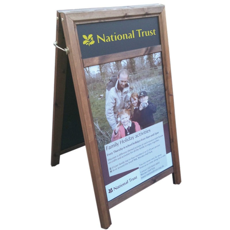
- Use a font that matches your brand’s personality. For example, a formal business might use a more traditional font, while a creative business could opt for something more playful. However, always choose a legible and easy-to-read font. Avoid overly decorative or complex fonts that may be hard to decipher from a distance unless it’s part of your brand.
- Ensure that the font size is large enough to be read from a distance, and keep text to a minimum. Keep it simple and to the point.
2. Colour Choice:
- Use colours that complement your brand’s colour palette for consistency. If you don’t have a specific colour scheme, what about looking for a colour that appears on your shop front?
- Contrast is essential for visibility. Use high-contrast combinations, such as dark text on a light background or vice versa, which work well.
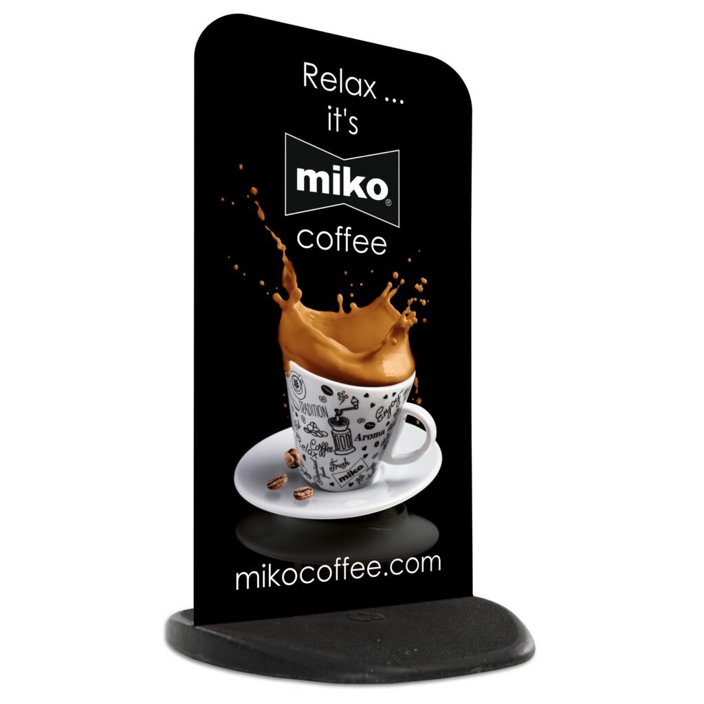
- Unless you’re a fancy dress shop, for example, limit the number of colours to avoid overwhelming the viewer. Stick to a few main colours that work well together. For more information on colours have a read of our colour guide.
3. Imagery and Graphics:
- It’s often a good idea to include your logo especially if you use it in your windows or on your storefront. If you do chose to use your logo make sure it’s clear and easy to see.
- Again, use something that fits your brand. An upmarket restaurant is going to use a very different image to a pet shop for example which can get away with a cartoon image for example.

- Whatever images you choose, make sure that they are of high quality and resolution to prevent pixelation or blurriness. Before you create your artwork check the requirements of the pavement sign supplier. For example at Discount Displays we require images that are 100dpi at full size. Visit our Image Resolution Guide for more information on the resolution for signs.
4. Message Clarity:
- Keep your message concise and to the point. Passersby should be able to understand your message quickly. Prioritise the most important information. If you’re promoting a special offer, event, or product, make sure it stands out that the focus of your message.
5. Consistency with Branding:
- Maintain consistency with your overall brand identity. The font, colours, and imagery on the pavement sign should align with your other marketing materials. Make sure the style of the pavement sign matches the aesthetic of your business.
6. Consider the Environment:
- Consider the surroundings and the environment where the pavement sign will be placed. Choose colours and imagery that will stand out in that particular setting. A modern pavement sign sign may look out of place outside a rural Pub, so consider a rustic chalkboard instead.
7. Test and Review:
- Once you have done a mock-up of the design, show it to your colleagues and get their feedback. Sometimes an outside perspective can provide valuable insights. Test the design by viewing it from various distances to ensure that the font size and imagery remain clear and visible.
Remember that the goal of your pavement sign is to capture attention quickly and effectively communicate your message. By thoughtfully considering font, colours, and imagery, you can create a visually appealing and impactful pavement sign that successfully draws people’s attention.