What Are The Best Sign Colours To Use
When it comes to how easy a printed sign is to read, the contrast between background and foreground colour is one of the key factors.
Formulas can be used where light reflectance is used to calculate the contrast between colours. By subtracting the darker colour from the lighter colour and dividing by the light reflectance value of the lower colour, and then multiplying by 100, you get what is called the brightness differential.
Alternatively, you can rely on good old common sense or have a look at the colour combinations below.
Signs With A White Background
Black on White: 91/100 (brightness differential)
Blue on White: 84/100 (brightness differential)
Red on White: 82/100 (brightness differential)
EMOTIVE MEANING: Innocence, purity, clarity, simplicity (brightness differential)
USAGE: Museum signs, office buildings, retail signs, school signs (brightness differential)
Displays
89/100
Displays
84/100
Displays
82/100
Signs With A Black Background
White on Black: 91/100 (brightness differential)
Yellow on Black: 89/100 (brightness differential)
EMOTIVE MEANING: Power, formality, mystery
USAGE: Airports, office buildings, information and directory signs
Displays
89/100
Displays
89/100
Signs With A Yellow Background
Black on Yellow: 89/100 (brightness differential)
Red on Yellow: 82/100 (brightness differential)
Blue on Yellow: 79/100 (brightness differential)
EMOTIVE MEANING: Joy, happiness, intellect, energy
USAGE: Events, warning signs, sale signs, information signs
Displays
89/100
Displays
82/100
Displays
79/100
Signs With A Blue Background
White on Blue: 82/100 (brightness differential)
Yellow on Blue: 79/100 (brightness differential)
EMOTIVE MEANING: Depth, stability, wisdom, trust
USAGE: Road signs, public transport, banks, public spaces
Displays
82/100
Displays
79/100
Signs With A Red Background
White on Red: 82/100 (brightness differential)
Yellow on Red: 79/100 (brightness differential)
EMOTIVE MEANING: War, danger, anger, strength, love, determination
USAGE: Warning signs, retail sale graphics, road signs
Displays
84/100
Displays
82/100
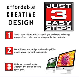
Discount Displays Graphic Design Service
At Discount Displays we offer a number of set price design packages, produced in-house by our team of designers. From a simple sign or banner to complex exhibition stands and everything in between.
FIXED PRICE PACKAGE DEALS