Here is our breakdown of the top 30 worst movie posters of all time. Ranging from the big box office hits to Netflix originals; you can be sure we researched extensively to bring you the most sub-standard, second-rate posters the big screen has to offer!
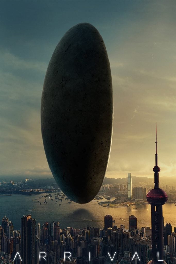
1. Arrival
The large building to the right is the Oriental Pearl Tower; a notable building, and a prominent feature in Shanghai, China; however, this movie poster is meant to be Hong Kong.
2. Ready Player One
At first sight a visually attractive and appealing movie poster, although there is one glaring flaw if stared at long enough. His right leg seems to be over 50% longer than his torso, a distracting feature of this otherwise well-designed poster, we would expect slightly better from a Spielberg film.
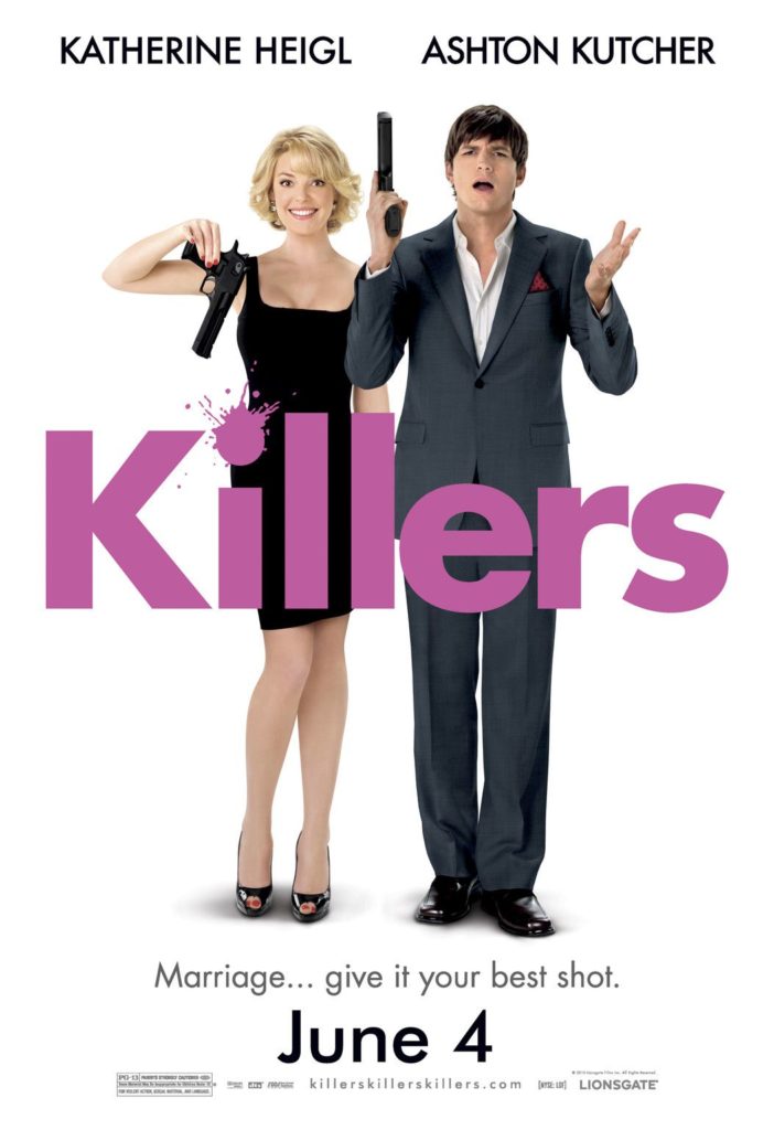
3. Killers
Seemingly your typical movie poster; main characters, movie title, and a tag line, basic but not deserving of this list alone. The main flaw is the blatant sexism displayed, with Katherine Heigl handling a gun unlike anyone ever; no one would instinctively wield a gun in this manner. Even Ashton seems unable to comprehend what the movie was thinking with this poster.
4. Thor: The Dark World
A feature in the Marvel Cinematic Universe with Thor’s story continued, a tale involving family, friends, and enemies; all of which they have managed to cram into this one poster. There are 10 people alone without counting the numerous dark elves featured on the ground.
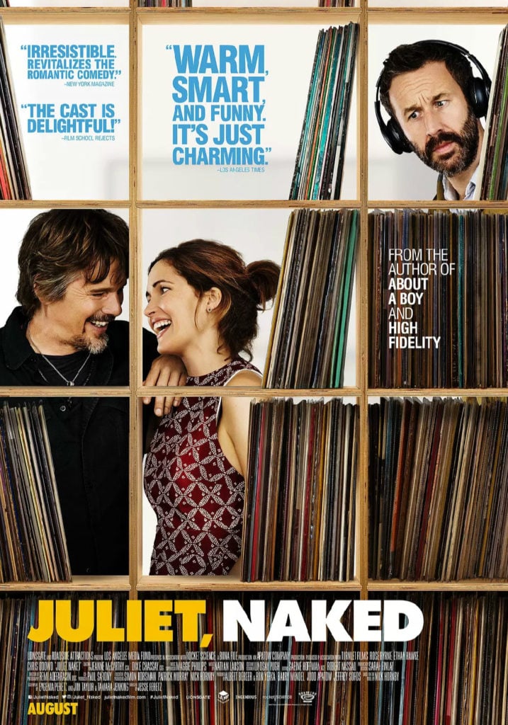
5. Juliet, Naked
Here you see an obvious rom-com poster with storyline already somewhat conveyed, yet one thing stands out the most, the fact that Chris O’Dowd seems to be well over a foot taller than Ethan Hawke. Although Chris O’Dowd is tall he is not a giraffe.
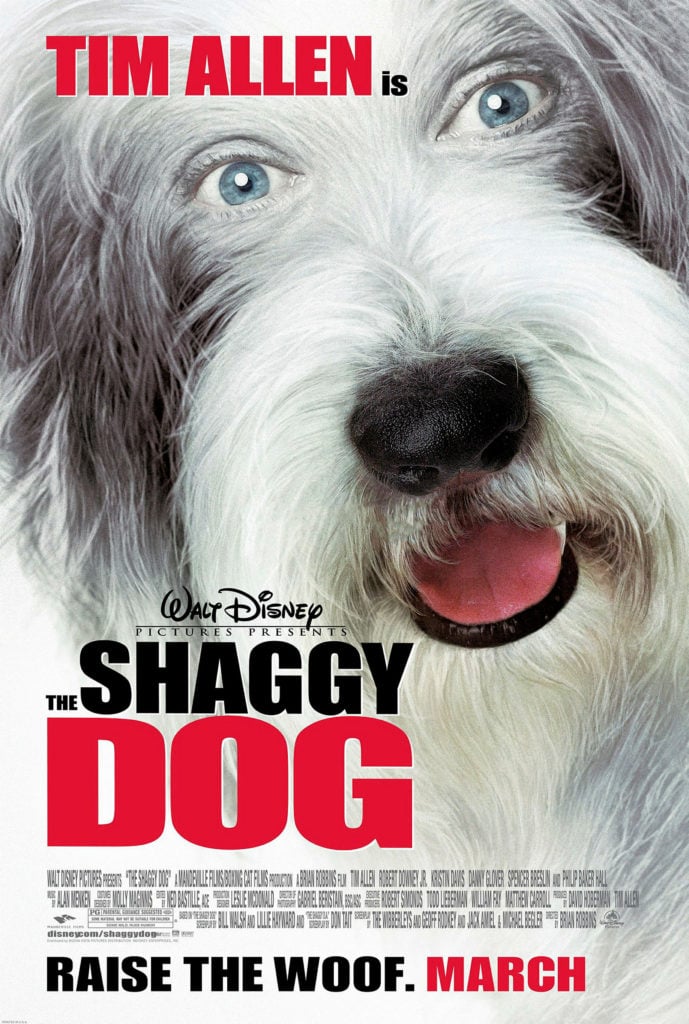
6. The Shaggy Dog
This poster is meant to depict a comedy film design for all the family. Yet It does the opposite, making me think it is Tim Allen playing a possessed dog, I think this is owing to the extreme close up and photoshopped human eyes.
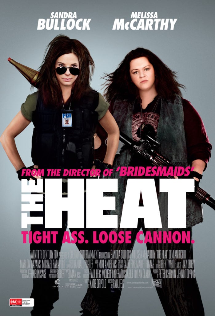
7. The Heat
A buddy cop action comedy featuring Sandra Bullock and Melissa McCarthy, with this information alone you would be sure for a good film. Yet we can’t help being distracted by Melissa McCarthy’s extremely photoshopped face. Airbrushed to an extreme, and even looks as if they have just placed her eyes, nose, and mouth onto an egg. There was no need for this level of picture editing in our eyes.
8. Zookeeper
I do not expect much from a Kevin James Film, but after seeing this poster said expectations are now set even lower. The awkward angle of which James’ head is placed, then simply the fact they have placed a gorilla into a roller coaster is just unfathomable.
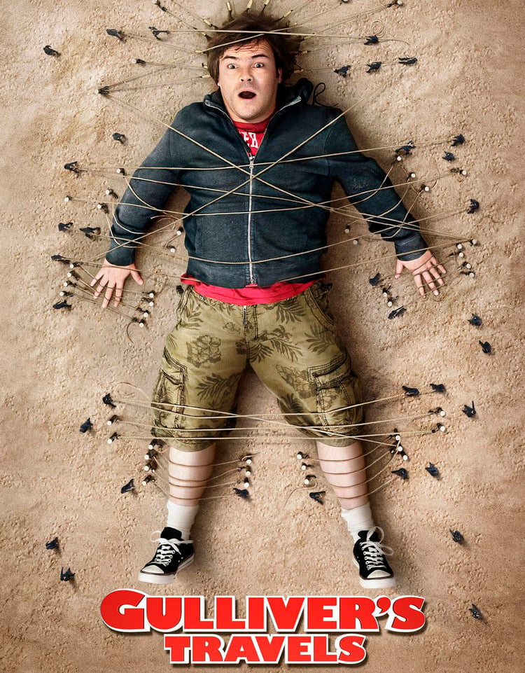
9. Gulliver’s Travels
This poster at face value shows the movie’s storyline to a point; displaying Gulliver being taken prisoner by an island of small individuals due to fear of the perceived giant Gulliver. However, upon close inspection of Gulliver’s face, it is clear to see something is missing: his teeth. Anyone with an average set of gnashers making that facial expression would display at least one tooth.
10. Tomb Raider
The latest film to feature the character, Lara Croft is Tomb Raider. The role is well played by the brilliant Alicia Vikander, who committed herself to the role with intense workouts, but I don’t think those were the cause of distortion in her neck such is shown on this movie poster. As you can see it is awkwardly long and twisted.
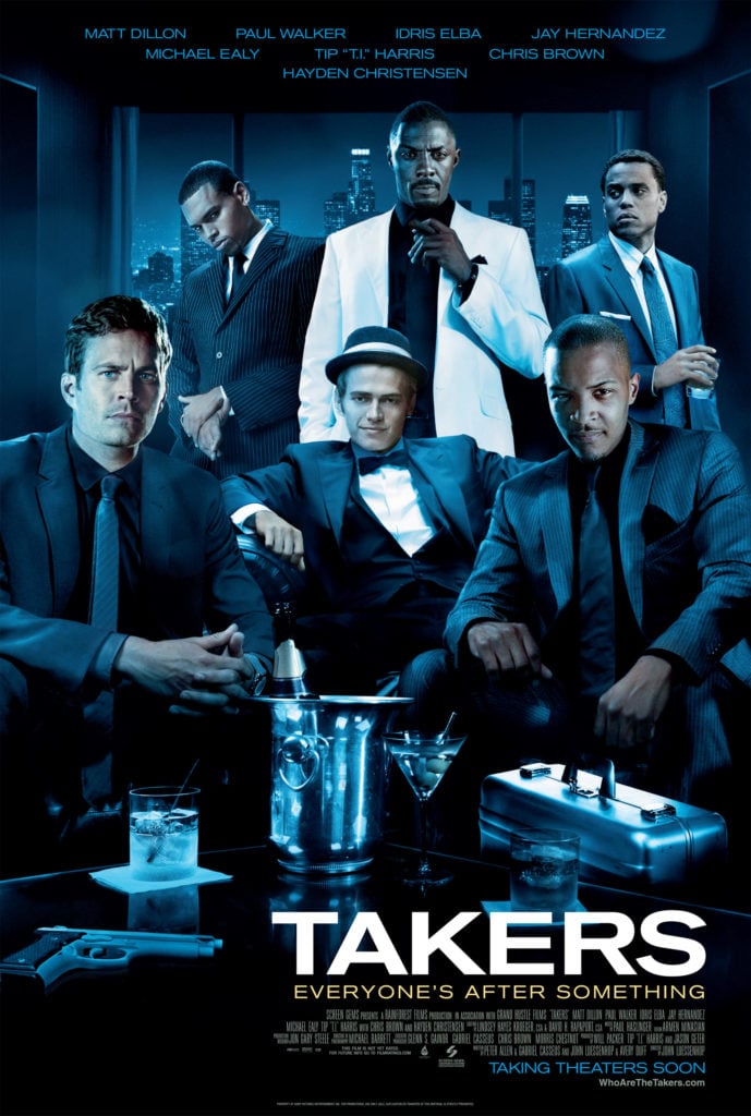
11. Takers
Featuring the late Paul Walker this crime thriller’s reviews rate it better than most would on first glance of this poster. None of the film’s stars appears to actually be in the room when this photo is taken. All heads are placed clumsily and obviously photoshopped, the worst of which is most definitely that of T.I.
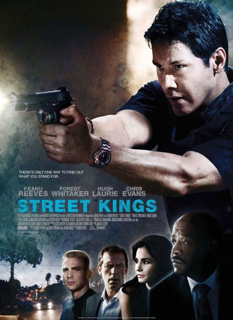
12. Street Kings
The main role filled by Keanu Reeves; the internet’s most loved individual this year and star of the John Wick Franchise. As you can see Keanu has handled weapons before his role in John Wick, although at this point maybe he was not trusted to handle a real gun, as you may be able to see the pistol that he is holding lacks a trigger, so let’s hope he doesn’t need to shoot in this film…
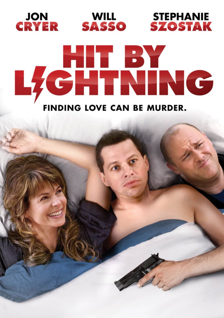
13. Hit By Lightning
This is up there as one of the worst on the list, with none of the characters appearing to actually be in a bed let alone actually in a photo together. Jon Cryer and Stephanie Szostak’s head are very obviously photoshopped; with Cryer’s looking stuck on top of the poster, and Szostak’s not matching the angle of her head and hair. To top it off Will Sasso’s character looks extremely misplaced and unneeded.
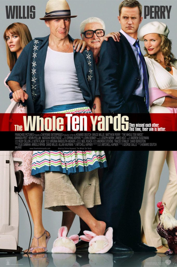
14. The Whole Ten Yards
With two big names in Bruce Willis and Matthew Perry, most would expect a better movie poster than presented by the film. A number of issues are obvious at first glance; Perry’s head and neck are seemingly merged into one, while Willis seem to not have a neck at all, and looking down Willis seems to have the leg of a small child, for comparison look at co-star Amanda Peet’s leg in the poster, and the difference will be obvious.
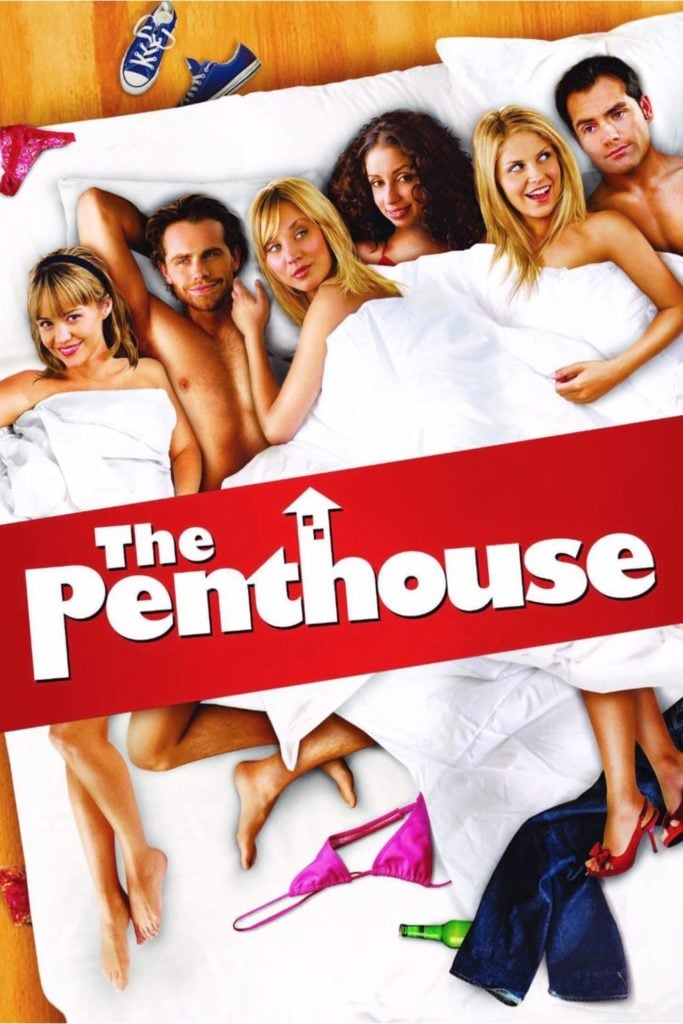
15. The Penthouse
With the movie’s title and the image used, you can gain a somewhat full understanding of this film’s plot. However, this does not make up for the atrocious level of stuck on heads exhibited. Not one of the actors seems to have actually been featured in the original photo, with their heads being added after the fact, and even worse gracelessly so.
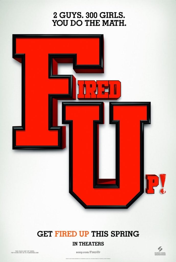
16. Fired Up!
Two words take centre stage in this poster, or more obviously two letters “F U” At first glance most would take offence at this abstract attempt to draw in passersby. Although should the poster catches your attention for longer than the second it took to take offence, you will notice a grand lack of substance and information in the poster. With further details being “2 Guys. 300 girls. You do the math.” and “Get Fired Up this spring” I cannot take a conclusion of the film’s plot based on the information, with the only clue being the American Varsity font used leading me to a film involving cheerleaders.
17. The Blue Lagoon
It’s hard to actually call this one a poster, with a majority of the area being taken up by poor copy in an attempt to get you to see the film; by crudely describing the image on the poster itself.
18. Chairman of the Board
Awful. Dreadful pun, alongside a too in your face depiction of the movie’s title through a picture of Carrot Top surfing in a blazer and board shorts.
19. Little Italy
Numerous flaws are present within this poster. To start all movie credits at the bottom of the poster are in grey text; making it extremely hard to see as it blends straight into the jeans of the actors. The image used to display the title of the film and also the colour palette for the poster uses the cliche green, red, white, and black that you may expect from an Italian reference. Colours which are used for the awful and cheesy t-shirts worn; of which Roberts’ seems to be deliberately cropped in an attempt of sex sells which from reviews this movie needed.
20. I Feel Pretty
There is no substance to this poster, Schumer and the tag line give not much of a hint as what you may be in for when viewing. The colours are bland and it is just lacking as a whole.
21. Robin Hood
Similar in style to the previously mention Thor Dark World. This movie poster is very crowded and is typical of a film in this genre, nothing is different, there is no one thing drawing me to this film over another on first glance.
22. Amityville: The Awakening
Awful. Uses attempts to appeal to a social media generation and lead into the film as one but I can’t help but just see an awful unaligned and bland poster.
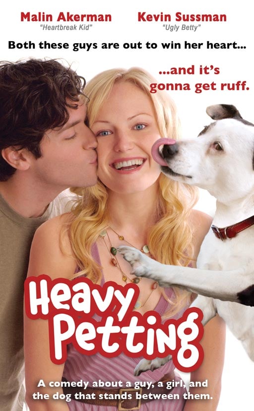
23. Heavy Petting
Puns and poor photoshop make for a truly disappointing poster, for a seemingly awful film.
24. The Bling Ring
Starring the Harry Potter star Emma Watson and a title that gives you a quick rundown of the film, that is, if you can read it. The use of overlapping bubble writing is distracting and causes greatly reduced readability
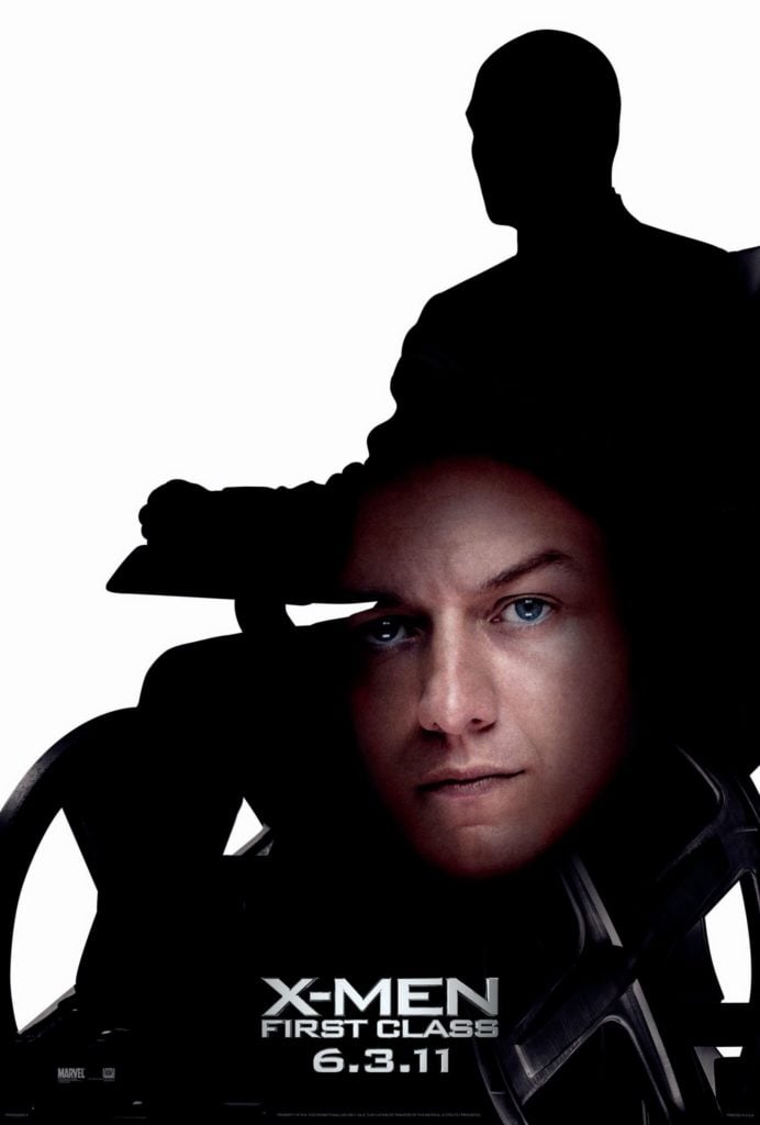
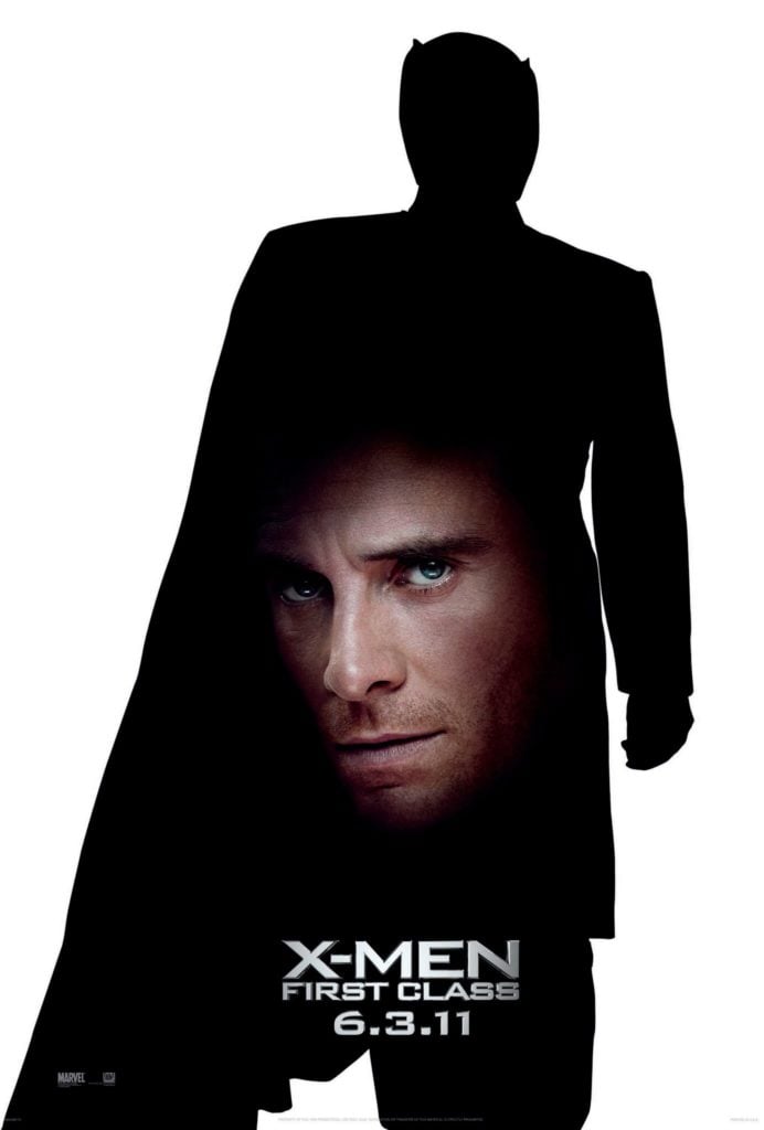
25. X-Men: First Class
The movie attempts to pay homage to the original x-men films that the prequels attempt to build from the success of, by featuring silhouettes of the original movies characters with a ghost-like face of their prequel counterparts. This just does not playoff, with its lack of visual information or attraction to want to go and see the film stemming from the poster design.
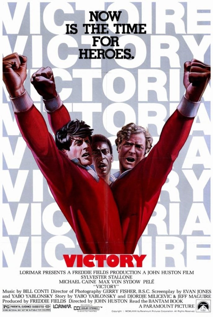
26. Escape To Victory
An all-star cast of legends with Sylvester Stallone, Michael Cane, and the amazing Pelé; all placed at the forefront of the movie’s poster. However, we feel they could have spaced them out a bit more instead of creating a Cronenberg type monster leading me to think I am about to see a horror film where footballers are merged together in an attempt for victory.
27. The Last Song
With Miley Cyrus and her now husband Liam Hemsworth being at the head of this poster, quite literally. An awkward attempt to sell the film based off of the actor’s influence alone, almost hiding the more descriptive head. The most uncomfortable looking aspect of this film is the tight crop on Hemsworth’s head, making him look like Zordon from the power rangers franchise.
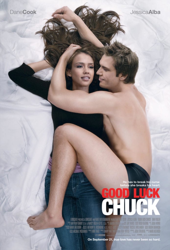
28. Good Luck Chuck
A combination of uncomfortable positioning in an attempt to pay homage to John Lennon and Yoko Ono, and weirdly smooth faces and bodies creating for a truly dreadful poster here.
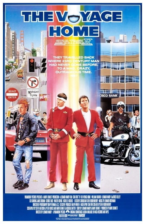
29. Star Trek IV: The Voyage Home
This poster is fairly well designed for its time and gives a general overview to the plot of the film alone, although maybe if I could read the white text printed onto the poster I would have a much more solid idea as to what I’m watching.
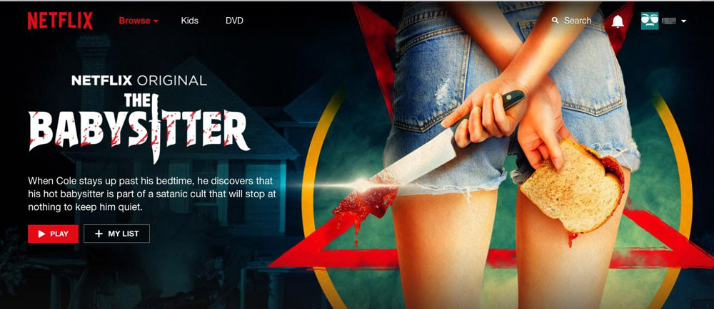
30. The Babysitter
This one is not a traditional poster but a digital one designed for Netflix’s The Babysitter. At first, it gives a good insight to the film; an evil satanic babysitter alongside its tagline. Although if you look closely at her arms crossed behind her back, she has two right hands.
Let us know what you thought of our selections, did we choose the very worst? Comment below if you can think of any more we should have included.