With thousands of fonts to choose from, deciding on which font to use for your next printed sign or banner can be a daunting task. While it is tempting to use something fancy to stand out, there is a good reason we see the same or similar fonts used time and time again. With signage text readability must always come first, it’s all good looking great but if no one can read it the message is lost entirely.
With the help of our design and print teams, we’ve put together a list of deciding factors when thinking about your next sign font, along with our top 10 choices at the end of the article.
Factors When Choosing Your Sign Font:
Usage of Sign
The legibility of a sign or banner is determined by the font or typeface used and how easy it is to distinguish one letter from another. Deciding on the type to use is influenced by the designated usage that your sign or banner may have. Lots of copy on an exhibition graphic may look great in a simple Arial or Times New Roman, but may have less impact used on a huge sale banner outside a retail outlet. Other things to consider are the surrounding area of the sign, the background colour and the placement of the sign e.g inside or outside.
Upper / Lower Casing
The use of case is also very important. Starting a word in a lower case and having the rest of the letters in uppercase rarely looks good, neither does a mixture of casing. Research has shown that all uppercase or capitalisation should be used for single words, whereas lowercase should be used for longer messages.
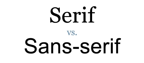
Serif or Sans-Serif
Most newspapers, books and newsletters and publications where there is a lot of text use a serif font such as times new roman. When it comes to signs and banners you will notice that signs without serifs or sans-serif are much more common. Sans-serif fonts are easier to read when there just a few words, so are great for making statements. Serif fonts might be used on an exhibition poster where there is quite a lot of copy.
Number of Fonts
For signs it is best to stick to one or two different font styles, otherwise it can look cluttered and unprofessional. If you do use a mixture of fonts, it is advisable to use similar styles to keep the overall feel of the sign consistent.
Sign Layout
The weight, size, spacing and layout of your wording all combine to effect the readability of your sign. Examine how the use of word placement, blocks of copy and text effects such as bolding and italicising have on the impact of your sign.
Character Height
In terms of sign legibility, the character height has a big influence on how far a sign can be read. As a rough guide, you can view letters in an easy to read font such as Helvetica in upper and lower case on a contrasting banner at 30 times the height of a letter, so for example a 4 inch letter could be seen at 116 feet. You can download our signs guide for further information on this topic.
Colour Combinations
Contrasting colours make more of an impact, but you need to be careful the colours of the fonts don’t clash with the background or surrounding features of the sign. White on black and black on white offer the best contrast, followed closely by yellow on black . You can read more about effective sign colours in the sign guide linked above.
Our Top 10 Sign Fonts
Below are our top ten choices for fonts that will look great on the vast majority of signage and banners. Hopefully this will give you some inspiration when designing your next printed sign.


If you’re looking to purchase signage, we have a huge range of custom printed indoor and outdoor signage as well as an in-house sign design service that will ensure your font stands out from the crowd.